Mobile-friendly web design has become an essential necessity for service companies that rely on their websites to showcase their offerings and generate client inquiries.
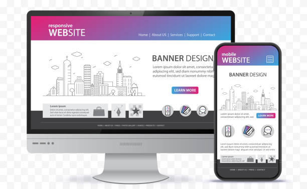
An effective website does not just rely on displaying properly on smartphone screens; it is tied to delivering a seamless user experience.
This journey begins with understanding how clients use service websites on mobile devices, designing intuitive navigation and contact actions for small screens, and optimizing site speed and content readability.
It also requires testing the complete customer journey to ensure visitors can browse services, contact your company, or request a quote without friction.
Therefore, building a mobile-friendly website demands a strategy that balances responsive design, fast performance, and clear information architecture.
Since the majority of smartphone users search for nearby providers while on the move, pairing mobile optimization with a targeted Local SEO for Small Businesses in Syria strategy helps ensure your services appear right when regional customers need them most.
How Clients Use Service Websites on Mobile Devices
Mobile users behave differently than desktop users when browsing websites and accessing information.

A client might be searching for a nearby service provider while on the go, looking up pricing and operating hours, or needing to contact your company immediately.
For this reason, mobile-friendly web design must start by addressing the exact questions a client wants answered:
- What specific service does the company offer?
- Which geographic areas or cities do you cover?
- How can the service be requested or booked?
- Is there a direct, immediate way to get in touch?
The most critical information should be placed where it is immediately accessible, avoiding forcing visitors to click through multiple pages before finding basic details.
You must also account for varying user intents. A client facing an urgent issue needs instant access to a phone number, while another prospect may want to compare service tiers and read case details before reaching out.
(To achieve this balance effectively, you can reach out to Devoura for tailored support.)
| User Type | What They Typically Look For | Element to Highlight |
| Client Needing Urgent Service | A fast, immediate contact method | Prominent click-to-call button |
| Client Comparing Providers | Service scope and transparent pricing | Detailed service breakdown pages |
| First-Time Prospect | Credibility, trust, and proven expertise | Client reviews and past project portfolio |
| Client Ready to Book | A clear path to request the service | Streamlined booking or quote request form |
It is also valuable to audit your website analytics to see which devices and pages visitors use most frequently.
Rather than assuming all clients behave identically, analyze top-visited mobile pages, traffic sources, and specific actions users take on smartphones.
Designing Navigation and Contact Actions for Small Screens
Designing navigation and contact actions for small screens calls for simplicity. Large, multi-column menus that work well on desktop computers become cluttered and overwhelming on smartphones—especially if they contain too many sections and links.

Use a clean, collapsible menu (such as a hamburger menu) that opens and closes smoothly, ordering sections according to their importance to the client.
Place links to core services, contact details, and quote requests within easy reach, avoiding deeply nested sub-menus that require excessive taps.
Contact actions must also be tailored to the nature of your services.
If phone inquiries are your primary lead driver, implement a prominent click-to-call button that launches the user’s phone dialer with a single tap.
Examples of Contact Elements on Service Websites
| Element | Primary Function | Best Implementation Practice |
| Click-to-Call Button | Initiates an immediate phone call | Display prominently in the mobile header or sticky footer |
| WhatsApp Button | Starts a direct chat conversation | Clearly indicate the purpose of messaging |
| Service Request Form | Captures qualified client details | Minimize required input fields for fast completion |
| Appointment Booking Button | Schedules a consultation or visit | Briefly explain the next step after booking |
Email Link (mailto:) | Sends a written inquiry | Offer as a secondary communication option |
Best Practice: Ensure buttons are large enough to tap comfortably with a thumb, leaving adequate spacing between clickable elements to prevent accidental taps. Use direct, action-oriented labels like “Call Now” or “Request a Service” instead of vague phrases.
Avoid crowding all contact channels into one tight space.
Instead, highlight the primary action you want the client to take and present secondary options in an organized layout—improving navigation clarity and boosting visitor engagement.
Optimizing Site Speed and Readability on Mobile Devices
Website speed and readability on mobile devices directly impact user experience—especially when a potential client opens your service page over a limited mobile data connection or while commuting.

Slow-loading pages often cause visitors to bounce before content appears or before a contact form finishes loading.
Improving mobile site speed starts with auditing image file sizes, converting assets to modern formats (such as WebP), and compressing files without sacrificing visual clarity.
You should also minify unnecessary scripts, defer loading non-critical elements below the fold, and invest in reliable hosting matched to your traffic volume. (You can also connect with Devoura to unlock real performance improvements.)
| Website Element | Potential Mobile Issue | Recommended Optimization |
| Images | Heavy, unoptimized file sizes | Compress assets and serve modern image formats |
| Typography | Text that is too small or cramped | Adjust font sizes and line spacing for easy reading |
| Page Code | Bloated scripts and unused CSS/JS | Minify files and optimize resource loading |
| Interactive Buttons | Difficult to tap accurately | Increase touch-target dimensions and padding |
| Pop-ups / Overlays | Obstructing core screen content | Minimize usage or redesign for non-intrusive display |
Ensure your layout is genuinely responsive across diverse screen sizes rather than tailored to a single phone model.
Monitor Core Web Vitals—specifically Largest Contentful Paint (LCP), Interaction to Next Paint (INP), and Cumulative Layout Shift (CLS)—as these metrics measure loading speed, page responsiveness, and visual stability.
Testing the Complete Customer Journey
Verifying that your homepage looks good on a smartphone is not enough; you must test the entire customer journey from start to finish.

A user might land on a specific service page, navigate to pricing details, and then attempt to call or submit an inquiry form.
If any step breaks down, your business risks losing a qualified lead.
Start by mapping out the core conversion paths you want visitors to complete, then test every step using an actual mobile device.
Pay close attention to the number of taps required, text legibility, ease of filling out form fields, how validation error messages appear, and whether click-to-call buttons work reliably.
Mobile Customer Journey Testing Checklist
| Testing Stage | Core Question | Desired Outcome |
| Opening the Site | Does the page render quickly? | Immediate access to above-the-fold content |
| Browsing Services | Is the information easy to scan and read? | Clear understanding of services without friction |
| Site Navigation | Can users reach key sections effortlessly? | Smooth, intuitive transitions between pages |
| Taking Action / Contact | Do contact buttons and forms work smoothly? | Initiating calls or inquiries without extra hurdles |
Once testing is complete, compile feedback and prioritize fixes based on their impact on conversions. After launching updates, continue tracking mobile traffic metrics and click-through rates on your primary call-to-action buttons.
Mobile Usage Statistics
According to StatCounter data reported via Statista, mobile devices accounted for 51.48% of global website traffic in Q2 2026, compared to 52.27% in Q1 2026.

Additionally, research from the Baymard Institute highlights that 63% of evaluated mobile e-commerce sites deliver a mediocre or poor mobile checkout experience.
While this benchmark specifically evaluates e-commerce checkouts rather than all service company websites, it underscores the critical importance of testing mobile forms and multi-step user actions to prevent drop-offs.
Frequently Asked Questions (FAQ)
What is mobile-friendly web design?
Mobile-friendly web design is the practice of designing and developing a website so it functions seamlessly on smartphones and tablets—accounting for screen sizes, intuitive navigation, readable typography, and touch-friendly interactions.
Why do service companies need a mobile-friendly website?
Clients frequently search for service providers and contact details directly from their phones. A mobile-optimized site allows them to access key information and request services immediately without frustration.
What are the most important elements of a mobile-friendly website?
Key components include responsive layouts, fast page load speeds, simplified navigation menus, legible text, thumb-friendly buttons, and streamlined contact forms.
How can I improve my website’s speed on mobile devices?
You can boost mobile speed by compressing images, minifying unnecessary code, upgrading your web hosting, enabling browser caching, and removing heavy third-party scripts that delay page rendering.
How do I test the customer experience on mobile?
Use real mobile devices to walk through the complete user journey—from landing on the site and browsing service pages to placing a call or submitting a form—while monitoring Core Web Vitals and conversion analytics.
How does Devoura help design mobile-friendly websites?
Devoura helps companies build responsive, user-focused websites that prioritize fast load speeds, clear content structure, and frictionless pathways for clients to explore services and get in touch.
Mobile-friendly web design is a direct investment in your customer experience and long-term business growth.
Optimize your site speed and mobile usability with Devoura to turn smartphone visits into real client inquiries.
If your business also plans to sell products or digital packages directly through smartphones, read our detailed breakdown on WooCommerce vs. Shopify: Choosing the Right E-Commerce Platform for Your Store to select a platform built for seamless mobile checkout
